You spend hours in your game library choosing what to play. Shouldn't that experience be beautiful?
The Interface Problem
Many game launchers were designed years ago and it shows:
- Cluttered menus with too many options
- Tiny game icons that are hard to see
- Outdated visual design
- Poor organization and filtering
When you have hundreds of games, a bad interface makes finding and launching them frustrating.
What Modern Design Looks Like
1. Clean Grid Layout
Games should be the focus. Large cover art in a clean grid lets you browse visually, the way game stores display their titles.
2. Dark Theme
Gaming happens in dim rooms. A dark interface is easier on the eyes and puts the focus on colorful game artwork.
3. Smooth Interactions
Modern UIs respond instantly. Hover effects, smooth scrolling, and quick transitions make the experience feel polished.
4. Glassmorphism Design
The current trend in interface design uses subtle transparency and blur effects to create depth. It looks premium and modern.
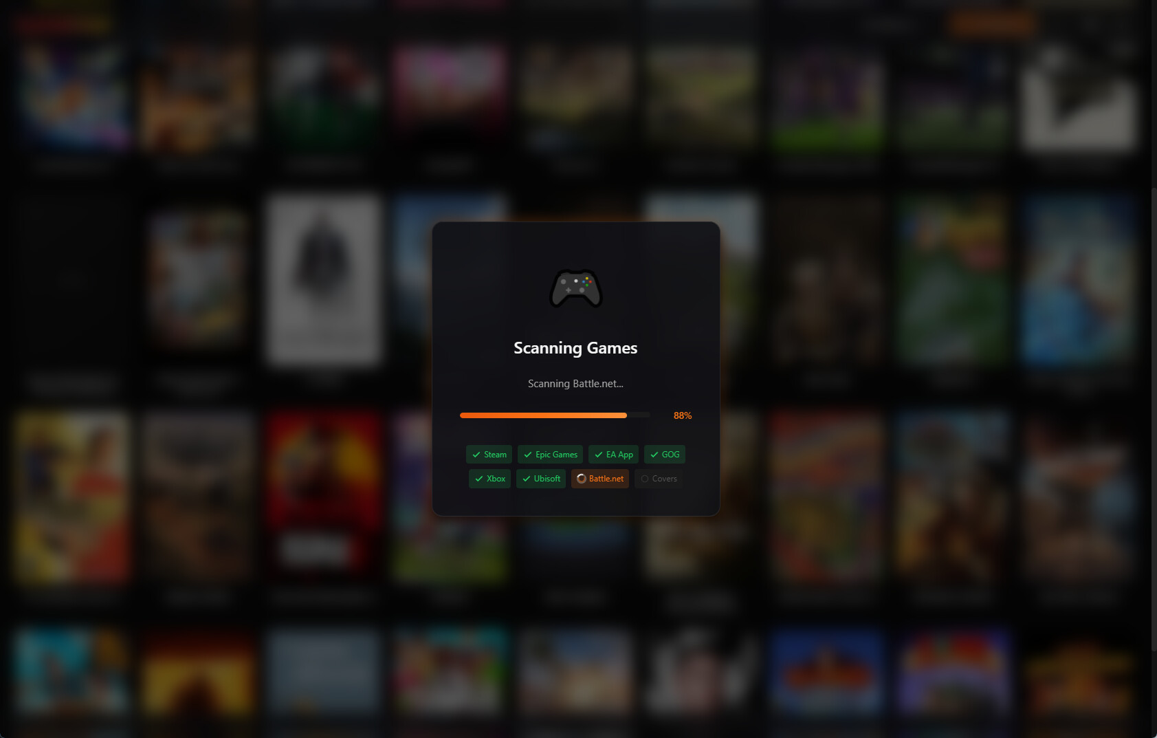
The Kolektor Approach
We designed Kolektor with these principles:
- Game-first layout — Large covers, minimal chrome
- Dark by default — Easy on the eyes
- Glassmorphism accents — Modern and beautiful
- Fast and responsive — No lag, no waiting
Your game collection is valuable. It deserves a beautiful home.
More Than Looks
Good design isn’t just aesthetic. It makes finding games easier:
- Quick search — Type to find instantly
- Platform filters — Show only Steam, only Epic, etc.
- Visual scanning — Cover art helps you recognize games faster
See the Difference
Experience what a modern game launcher feels like.